What is Chiaroscuro ? :
Chiaroscuro is an Italian term for light -dark. The description refers to clear contrasts.


EDWARD WESTON
|
|
Edward Westans images is using vegetables or fruits but not just an image of an apple that is healthy he goes for ones that are shivered up for an example when it is old and out of date like. The image on the side has more peppers and on cabbage or lettuce.it is effective because for an example the lettuce it has so many lines and a big stork which looks like a dress or a skirt. However its nice to see one thing to just think about that one object but personally I would put different objects in the back and blur it out but but not a lot so its still recognisable.
|


Tom Hunters images are all colour which is another way of contrast and the colours are contrasted with the other colours in the room and how thinks are based in the atmosphere and it tells a story and an individual life style of different people.I also like these images more then Edward Westan because it shows more in the image then just one thing so it looks more different then a pepper in black and white , but thats my personal opinion. I like the fact that theres a mixture of dim lighting and bright colours coz of natural day light and the night with sunset. If i got to meet Tom Hunters the questions i would ask would be : why did you chose to have models of people in each image ? , Why did you use an realistic set? , What made you think of these images before you made them and taken them? what activity was you doing when you was thinking of taking images like this?.
Tom Hunter
Tom Hunters images are all colour which is another way of contrast and the colours are contrasted with the other colours in the room and how thinks are based in the atmosphere and it tells a story and an individual life style of different people.I also like these images more then Edward Weston because it shows more in the image then just one thing so it looks more different then a pepper in black and white , but thats my personal opinion. I like the fact that theres a mixture of dim lighting and bright colours coz of natural day light and the night with sunset. If i got to meet Tom Hunters the questions i would ask would be : why did you chose to have models of people in each image ? , Why did you use an realistic set? , What made you think of these images before you made them and taken them? what activity was you doing when you was thinking of taking images like this?.
Images at school :
|
When I took these images at school, I wanted a change so instead of taking images of just nature I added people to make the images more effective and different then my normal images that are just nature however I will still use nature in my images because that's my special tee so if I had to change it up completely which means don't take images with nature in the background or of nature one I would be lost and I would not feel completely comfortable and I don't think I would enjoy it i just feel that its my personality and I find it fascinating. What I tried to was changes the composition of the lens of the camera. My favourite image is the second image on the top right corner this is because it was the spare of the moment and when I got back to upload them, and I flicked through the images and came across that image I did not see how lovely and to me perfect as it has shadows, people, rule of third and nature so thats why I find that is perfect for me.
|
|


Fay Godwin
|
|
"Maybe black and white is the best medium for landscapes, I don't know."
-Fay Godwin Fay Godwin is a british photographer and her spealtse are the country side and the coast landscape. Personally she is my favourite photographer and she takes images that I take which is nature and animals which I do a lot. When you look at each of her images or the images that I have put on the left hand side she takes images that tell a story and if i was an book editor I would advise or ask her to use some of these images because it tells a hole book in one image for an example if for instance she use the dog jumping over the wired fence you can get many I dears maybe the dog is running away to a better place or maybe the dog is training to go on grafts but the use fences because it cheaper so thats why I love looking at her image i would look at them for a long time just thinking / brainstorming idea. Another thing about these images is that she uses the weather to make the idea more realistic and interesting to look at such as one of the images look like there is a storm coming or really bad rain coming over which country side normally have you can see the clouds are dark however because the cloud's are dark any way the cloud are going to be darker the it already is.
|


Elliot Erwitt
|
Elliott Erwitt photography is black and white. As you can see the image on the over side you can see his image is focusd on the little mirror on the out side of the car of a couple really loved up and young personally it look like they are in the 60s/ 70s because of the hair on the female and her earings and from the amount that you can see of the car is and old car. What i love about this image is that the have combined young love with a sunset which in them days you went away on the car jouney to a beach in the late afternoon when you can see a sunset coming but its still brighter. He has also shown that it is a loverly background / view however its blured and the focus is the side of a car and the mirror. My opinon of this image is that is simple but it still is intresting but it looks like it was timed to get the background just right and the angle of the image so even though it looks like a easy image that it was just captured without no planing but if you think and look straight into the image and just think of the steps that he might or took to get to this final outcome of the image.
|
"I don't start out with any specific interests, I just react to what I see. I don’t know that I set out to take pictures of dogs; I have a lot of pictures of people and quite a few of cats. But dogs seem to be more sympathetic"
-( Elliott Erwitt). 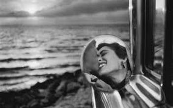
|
Homework image :
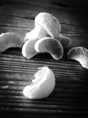
I used the sunlight from the window so the left side of the image is lighter than the right side.The sunlight is coming through the window from the left side of the photo.The light that I used was sunlight but with the objects blocking some of the right side it has strong shadows.
The oranges texture is rough, because the white on the orange outlines the lines of the orange on the right side of the image. Also the table has got sharp lines which makes the images have more lines . Also the oranges that have more of the light (left side) on them have got a softer texture then the one that have more of an shadow on them. The two textures rough and soft can be noticed by looking at it straight away because you look at the oranges straight away cause it is the main and only object in the image.
In the focus of the image is the oranges piled up, because it was my main focus.The table is in a kind of a blur because it was not my focus and it is in the background.When I was taking this image I didn't actually have a motive I just thought of it and took it so when I look back at it now One thing that comes to mind is good and bad , light and dark this is because on the right side it is more dark but on the left side it is light and softer so if I had to make emotions for the two sides the lighter side I would say it is more delighted and the darker side down cast/ downhearted.
The angle of the image is straight (no angle) because it did not really matter to me to have the image at for example 90 decrease angle but may be people who look at this image might think well if it was at this sort of angle it might make it more interesting to look at more or maybe it might looks OK as it is , my opinion is that I like it the way it is.
My image is kinda small and unclosed because the oranges is all I really needed in the image and they only thing I wanted to take an image of to be completely honest.There is not really a frame in the image but sharp edges if that is a frame. The image is in black and white and the reason for that is because you can really see the contrast of the lighting of the image and if it was it colour it would take that away because you would look at the image and see the colours and you wont really look at the lighting aspect of the image.
Daily sunlight images :


Evaluation :
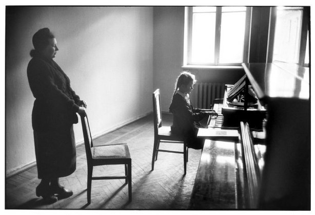
ELLIOT ERWITT
|
This is my favourite image because its quite old fashioned in what they wear and how the objects are the same such as the chair. It has brilliant lighting to the image because its not to bright and its not to dark, I would say its later in the morning because it really bright however it could be early in the afternoon.I think personally its composed and they have been told to be standing or sitting. There is different tones to the image 3 types of white and 3 types of black shades which makes the image more interesting because it has different types of tone in there. I think because it does not focus on one object it makes it more interesting to the audiences eyes because you can see that every thing is linked together and if you look at it in a mathematical way there is to of every thing for and example there are : 2chairs, 2 people , 2 pianos and 2windows that are semectrial which is clever by the photographer. This image is beautiful the way it just so calm
|
Holiday Homework:


Home images :


Evaluation
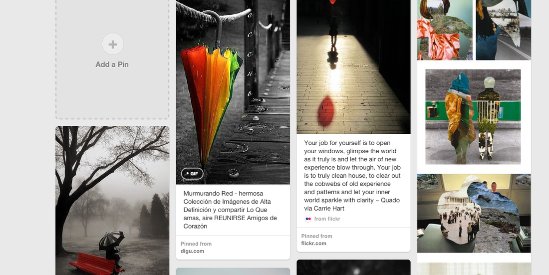
These photos I have taken is from to days in the half term holiday one of the days are from a day at the beach with my family at minis bay in broad-stairs and the other day was when I was bored and had a feeling of excitement when I thought of taking photos in my back garden on a sunny sunday afternoon. I was inspiration of taking these images is because when I was looking at Pinterest and I came across some images that are black and white and one part of and image is a bright colour or just a bright colour. I loved taking these images because it was different and it has my best stuff to take images of which is nature and outside scenery , this is because it just makes me want to stand in the country and take in the scenery and breathe in the air. As you can see these images have one object that has come in multiple times because one thing that I love is mages of flowers I don't now way but when they are painted or taken of a camera it just looks beautiful. So for my next images that i will take will not be of flowers as it will never get boring for me but may be people that look at my images. I hope to get nice image that are not the same old flowers that i normally take.
Daido MoriyamaHe created his work for the first time 1964. I personally like these images on the right of this information is four of my favourite images from him has it is to do with the make up of the face and as I want to to take images of hair and make up on people that I have done.
|
|


Final Pieces


I took images of eyes two that are open but different ways and on closed I did this because if feel that eyes have so much texture and everyones eyes are similar but at the same time different in different ways which I find so interesting and fascinating. I used photoshop (which you can see up the page) to smooth the eye to get a more smoother effect then I used pic-monkey to change the eye colour then changed the background and the background for all three is water but different types. No photographer inspired me because I mostly like to make it mine and i know there is a photographer out there that might like to take image of eyes but in a totally different way then me and i rather say its my work that i did from scratch then copy right or do images from others but I have taken a group of images up the page in my school. I love each of these images not because they are mine because it tells a story for an example the middle image is an eye close and the water background is gentle and quiet if it was a sound. I love telling a story through my images as i can express better then writing it down thats why i do more experimentation the evaluation.


These images are of my favourite thing i love to take images of which is nature (flowers) each of these have a personality if you look ever carefully for an example the middle of the three images is fragile and sweet this is because the pink flower is very smooth and so it show that its fragile and the sweet and if this was a really person they would walk with a flow and relaxed like when your on holiday and your floating on a inflatable in the pool with your eyes closed and feeling the sun beaming down on you. for these images i only used pic-monkey to edit them. If these photos was in an expedition I would look at it for a minute and true and see the story to me as the photographer of these images now and can see straight away but if not you will now what to do because i would call these image "human personality flowers" and from that i would guess there personality.I did not use any light for these images because I used a app and developed it so many times. The texture of the images are soft especially the pink flower in the middle. For the middle image u can see the softness more because the background was not as darker then the others.The middle images has a sharp focus on the flower whereas the flower that is on the right the line of light is in the focus. However the image of the feather on a bed of shells does not have a complete focus. All of the images are at a straight angle however you could say that the feather is at an angle so the image looks like it is at an angle.All of the images are in colour and thats what i wanted because it gives the image more of a look and a story which I aimed for .


These images are also developed / edited on picmonkey cause at the moment I really enjoy using it and it gives me a really good effect on my images. These images are more fantasy like for an example the last image between these images is a tree that has a background of water that is shining down and then a stars like coming done in like a sun light shine. And i would put this in the fantasy section because it looks magical.The light is basically the colour I chose to change on pic monkey however in the images "swan and tree" has a light reflection as u can see.For all the images the main focus are the daisy flower , the swan and the tree.The objects that are in focus are every noticeable because they are in the main foreye of the cameraThe texture of the images are all different to each other so there is : rough paper,soft and tangled. all of the angles are kinda different so the flower is like on a angle to the left , the middle is on a straight camera view and the tree image is on a lower point of view.They are all in colour because i feel like it looks best and gives it more of an effected a good effect.


In these images i used pic monkey to create the background. I chose to change the background to make it more interesting, it makes the image more abstract take the middle image for an example, with the sunset effect with the sunlight over the grass the people look like clay models. i have put them in the exact position, like the way Wallace and Gromit was made. It looks like it might be fake however the way the background has been placed. The texture of these images are soft and smooth which gives of a lighter thought once u look at them this is good because the images are quite dark.
FINAL EVALUATION :
From the first day when this project started I looked on Pinterest and what caught my eye was the images that are in black and white but one object was a different colour so at first I researched artist and only did black and white images for a while then at home I researched contrast and decided to change the background of a coloured image. My main focus was nature an people and to be honest I think that I achieved this and I'm happy with what I have done and I think that I don't need to change anything however I really enjoyed this project when I got in to it I liked it. Personally I think that my favourite was Street photography because i had a lot to say but with this one my evaluation is in the images and people that view it need to look and find it them selfs .
